Heat Sink — Building Under the Indian Sun

- vobbilisetty ashwika kundan
The Endpaper
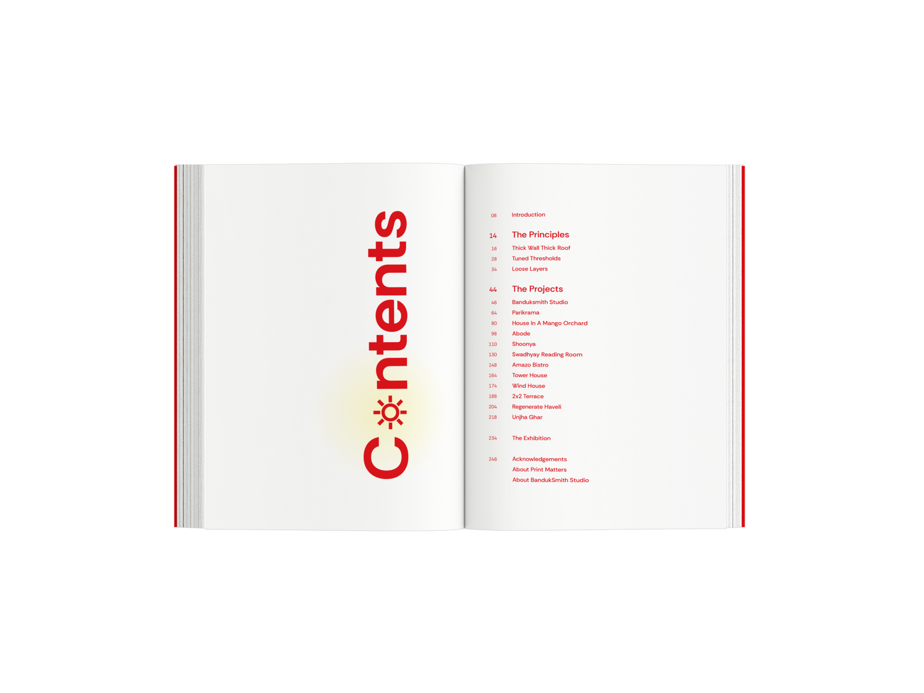
The Contents
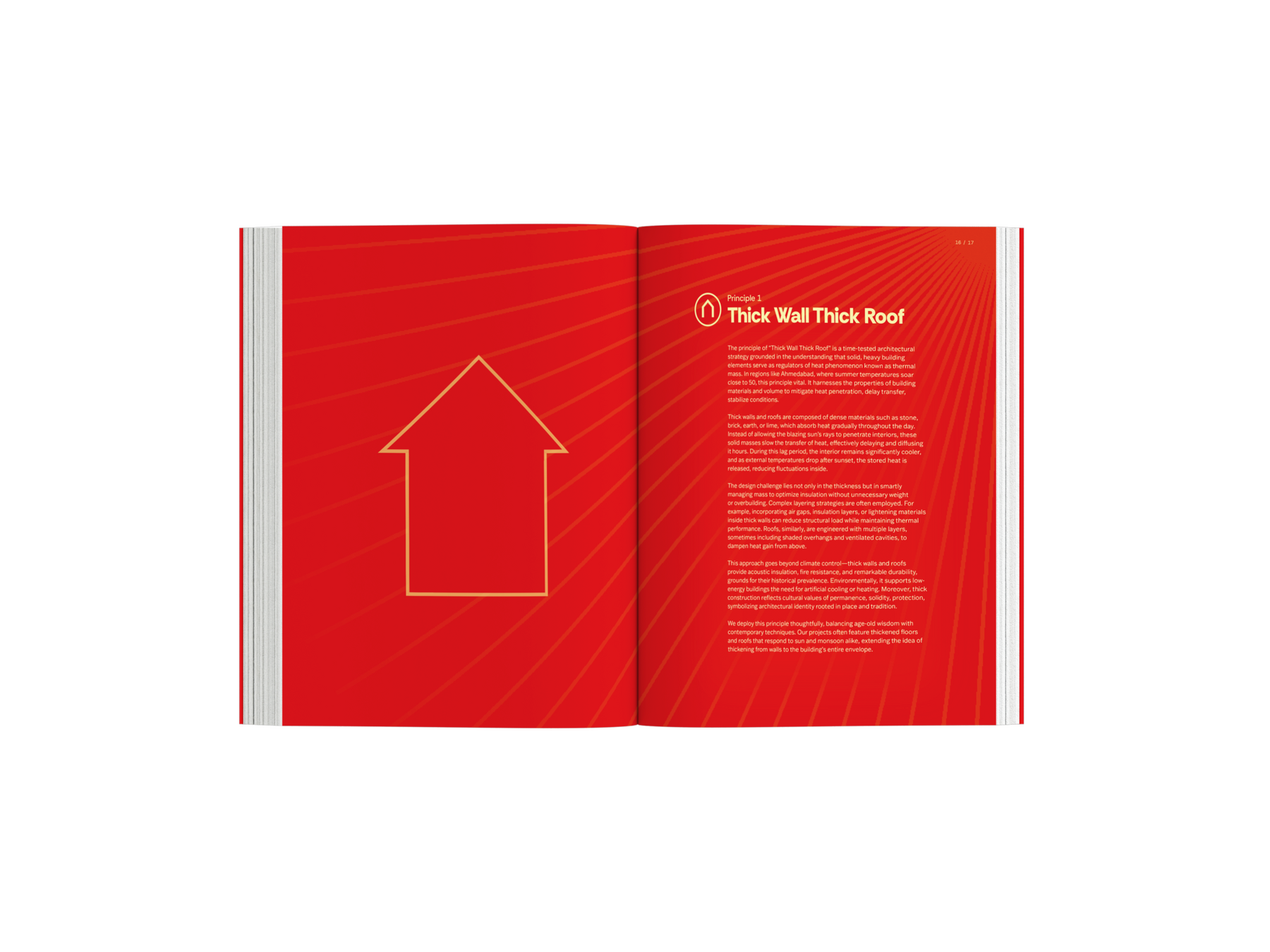
Principle Illustration: Thick Wall, Thick Roof
The Embedded Book Edge
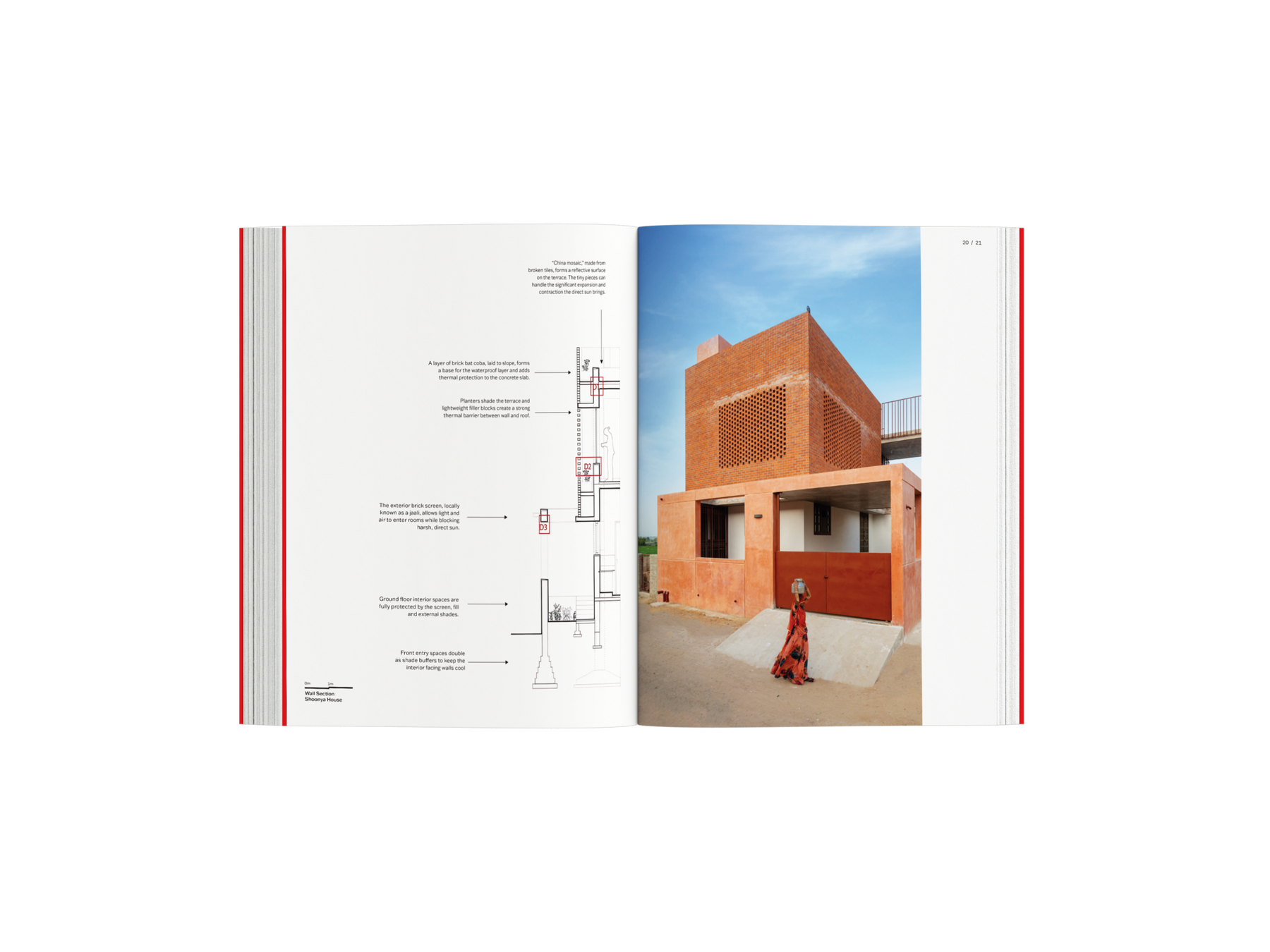
Heat Sink is a publication created in collaboration with Banduksmith Studio, an Ahmedabad-based architectural practice that works with climate and craft. The book is built around three principles the studio uses in their projects across Gujarat’s hot, dry, and composite climates: Thick Wall Thick Roof, Tuned Thresholds, and Loose Layers. These principles show how buildings can cool, shade, and filter air through design choices rather than relying on mechanical systems. The publication sits between an architectural monograph and a learning resource. It documents selected projects and explains the thinking behind them in an easy-to-follow way. The aim was to make climate-responsive architecture understandable not only for architects and students but also for lay readers who often experience architecture without an entry point into how it works.
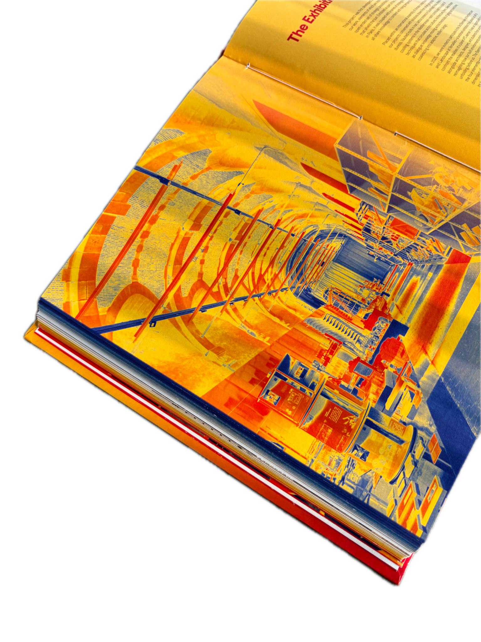
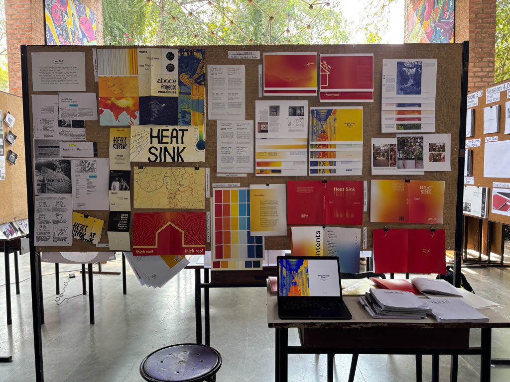
The approach focused on clarity, consistency, and building understanding step by step. One of the main challenges of this project was the lack of content. Most of the material provided consisted of images and short project descriptions. To build a stronger narrative, I studied similar architectural publications to understand how they structure information and guide readers. I also analysed the existing content to identify gaps and gradually created additional explanatory text. Thermal imaging became the basis of the graphic language, as it visually represents heat and temperature, directly connecting to the subject of the book. This helped shape decisions around colour, gradients, and visual hierarchy. To make complex ideas easier to understand, especially for lay readers, I created simple vector illustrations that explain each principle before the projects are introduced as examples.
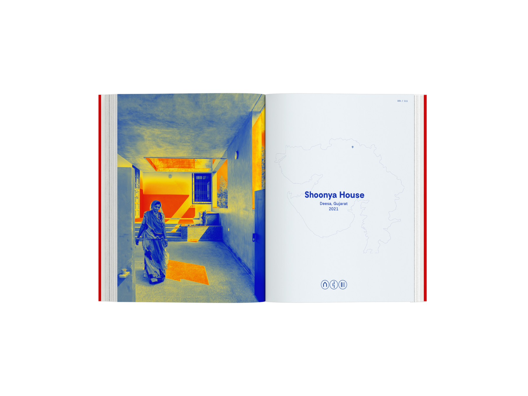
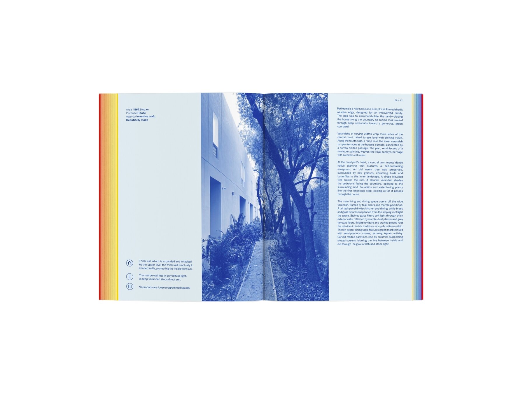
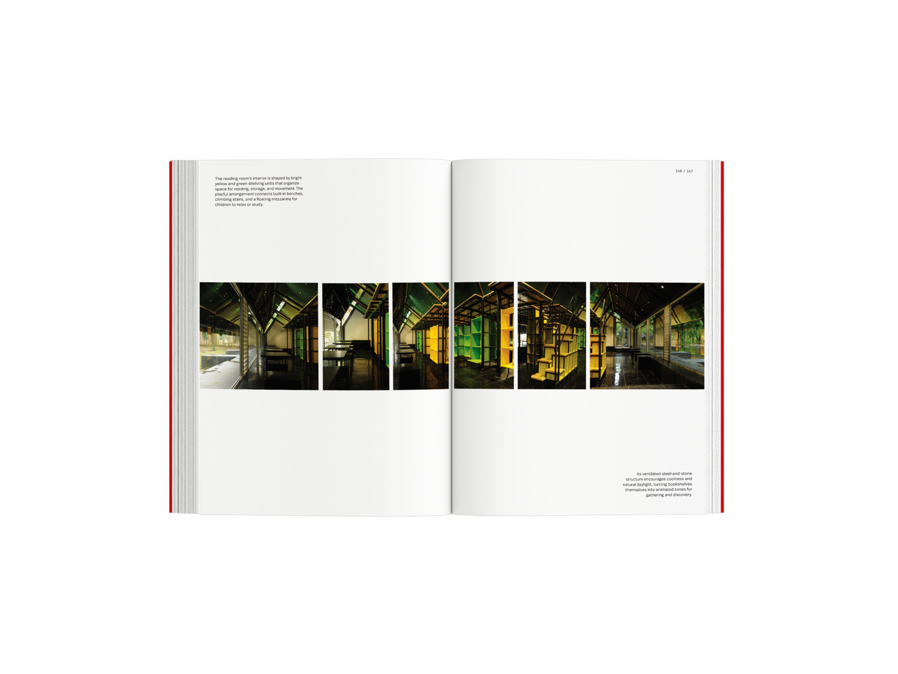
The final output is a hardcover, section-bound publication (to lie flat open) that can be used as a long-term reference. The book begins with a principles section, where each method is explained using short texts and vector illustrations. This is followed by project spreads that connect these principles to real buildings. Each project uses a consistent two-spread layout, with a thermal image marking the start of the project and a subtle map of Gujarat indicating location. Small icons show which principles are applied in each project. Colour gradients inspired by thermal imaging run through the book, along with embedded book-edge strips that move from red to blue to represent heat flow. Carefully curated photography, generous negative space, and a clear layout system bring together content and visuals into a cohesive reading experience.
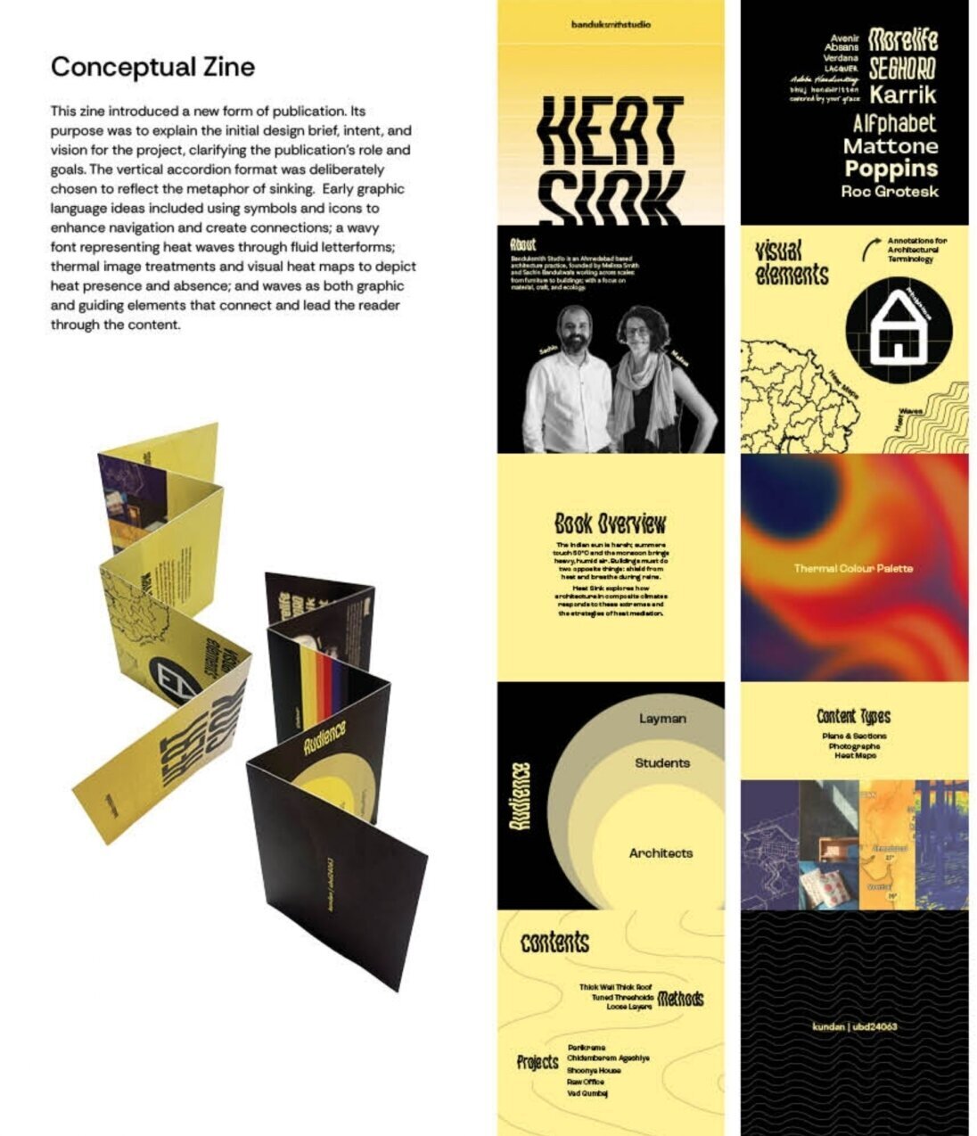
A Conceptual Zine (explains the design brief, intent, and initial vision)
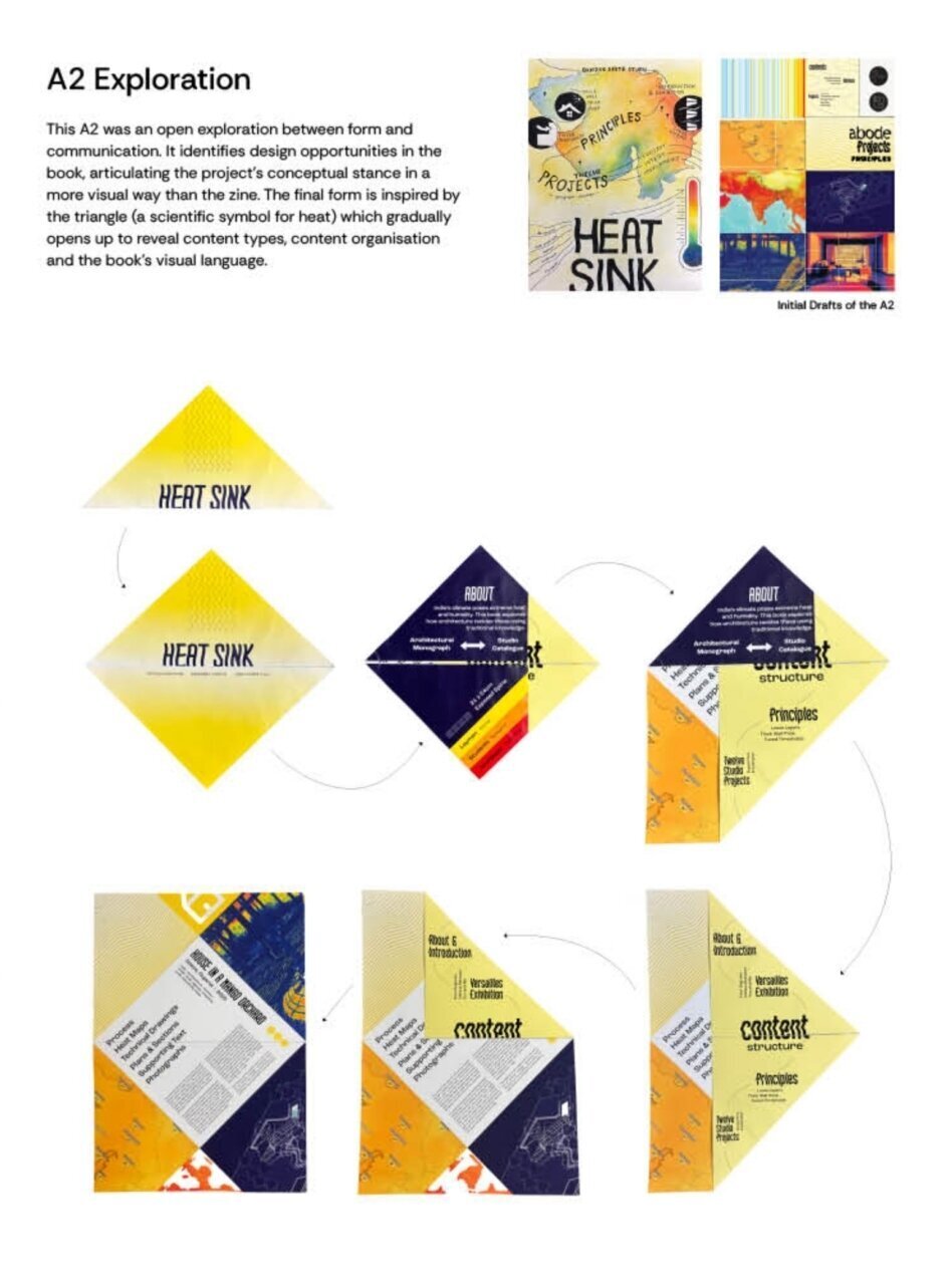
A2 Exploration (an extension of the design brief that explores content types, graphic language, and how form can respond to content and concept.)
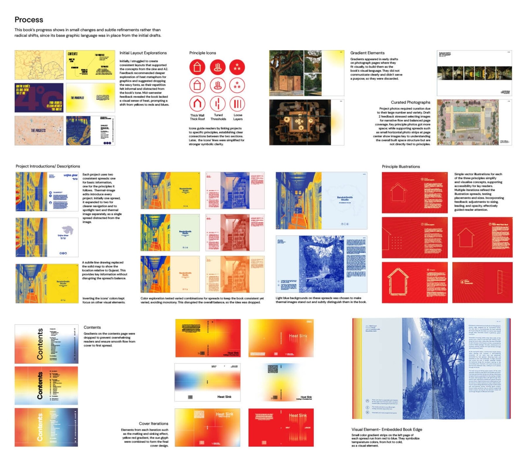
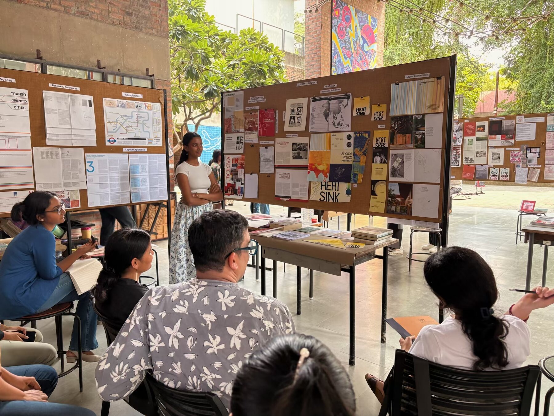
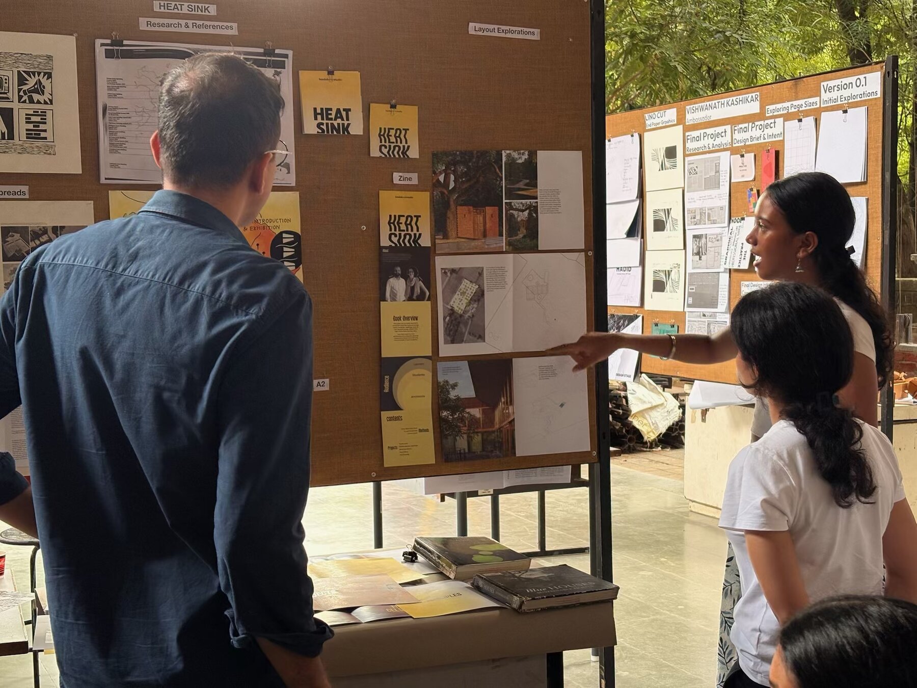
The Process
Awards
- CEPT Excellence Awards CEPT Excellence Award Monsoon 2025 CEPT University
- vobbilisetty ashwika kundan